Friday 27 November 2009

Chapter5 plus two

C0loured papers for future designs continued.( 2X half A5 sheets) 
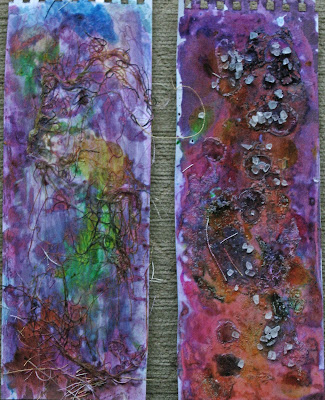
Both of these samples were created using diluted PVA with added drawing inks. It was interesting to note that this did not create the gel effect of image 12 .I can only deduce that the interaction of the contents of the acrylic paint used in that experiment ,with the other two elements, caused this effect. I will try to find the scientific explanation.
In the sample on the left, once the painting was completed, the sample was coated with short cut lengths of machine embroidery threads in toning colours,scattered radomly across the surface.
In the right hand sample the PVA was of a thicker consistency and the inks were dripped on to the surface using a medicine dropper.
( PVA solution 1 was 30% PVA and 70% water and in the second sample it was 60% PVA and 40% water)
Before the sample was dry the surface was sprinkled with coarse grained salt. This absorbed some of the colour and also caused the thick PVA bubbles to burst, leaving a coloured circle with 'crusty' rippled edges. This technique has potential for future designs involving water pools etc. once it is replicated on fabric. Once the sample was dry some of the salt just fell off but some grains adhered to the surface and were left for added texture.
Lesley V Jones

Tuesday 24 November 2009

Chapter 5 Colour Study

IMAGE 1. (A4 Sheet) EXERCISE WITH LONG NARROW STRIPS.
Within the context of my original title 'Life at the Margins :Where land and water meet' I have now begun to narrow the focus on to the topography and colours of the landscape at the interface of land and water. As demonstrated in the first chapters of the module, this interface can sometimes be clear cut and even harsh whereas at other times it can be indistinct,with blurring and merging of the two elements.
I experimented with 4 different strips, matching the colours with a mixture of oil pastels, felt tip and soluble pencils. I decided to focus on the Scottish loch landscape and some of my reasons are recorded in the sheet below : Image 1.
IMAGE 2A (A4 SHEET)
Focussing on the colours of the study of the lochside, and mindful of the Scottish connection I made a rubbing over a rough tweed fabric using oil pastels. IMAGE 2 B ( 3'' DIAMETER)
Following on from the first trial I then used wax crayon over a rough scottish oatmeal biscuit to produce this sample.
IMAGE 2 C (A4 SHEET)
I again used items associated with the landscape , namely pine cones and conifer clippings, to produce this sample, making the colours more vibrant and in different proportions to image 2a. IMAGE 2 D (A5 SHEET) This rubbing was made over a single conifer frond with water soluble pencil. The whole was then 'washed' over with a paint brush dipped in water. The result was a more muted study of the colours. The whole shape of the fronds of the conifer leaf is now outlined by a typical broad leaf shape, to demonstrate the contrast between the two species.
IMAGE 3 (A4 SHEET)
In preparation for a number of the potential ideas I formulated for the work of this chapter I made a series of Printing blocks. At the top-
Piping cord glued on to polystyrene in the shape of waves
In the centre a crocheted string shape, loosely a sea shell.
At the bottom left fir tree shapes cut from sponge
At the bottom right crocheted string made into a pine cone shape
Each of the elements was coated with gesso prior to use to prevent the print medium soaking in. IMAGE 4 COLOUR BOARD (measurements alongside)
The colours were mixed from dilute acrylics and designers' gouache.
Row 1 Colours in tones on a white background with spaces.
Each colour appears self contained and stark Row 2 Colours are overlapped on a white backgound which gives a much greater sense of their harmony and cohesiveness within the landscape.
Rows 3-6 Colours are placed on background colours which are present in the landscape In row 3 I feel that the lavender background shows off the colours to their gratest effect,perhaps an echo of the landscape aginst the sky.
In rows 4 and 6 the backgound colours tend to mute the individual colours and give a duller effect overall.
In row 5 the background colour, being lighter, highlights the individual colours but gives a more drab effect overall than row 3 Row 7 The colours were placed on a background created by using a teasel to make marks using paints left in the pallet from each of the mixings of the individual colours. Although the colours are all present in the backgound it does not create the kind of harmonious effect I was hoping for.
Row 8 The colours are set on a red background, a colour which does not figure in the colour study. It appears garish and out of keeping with the whole.
Row 9. The colours are placed on a metallic card background . I had expected this to provide a sample which seemed totally at odds with the overall colurs in a landscape with no hint of metal. In fact I feel that , because the underpinning colour of the mettalic sample is represented in the landscape, the background works surprisingly well.
Row 10 The colours were placed on samples which had some relationship to the landscape , namely tartan and wood. The tartan sample , being predominantly red, has a similar effect to the the study in row 8. The background wood sample provides a more harmonious whole.
IMAGE 5 COLOUR WHEEL (A4 SHEET)
IMAGE 6 COLOUR STRIPS WHITHIN THE WHEEL (A 4 SHEET)
IMAGE 7 COLOUR BOARD (A 3 SHEET)
I used this to mount further examples of colours within the landscape, each labelled within the board.
IMAGE 8 COLOURS IN PROPORTION TO THEIR OCCURENCE.(4''square)
I made this sample from layers of kichen roll on a muslin background, each layer being glued with dilute PVA. While the 'sandwich' was still wet I rolled over the surface with a lattice pastry cutter to form squares which were slightly raised from the surface.I then used a craft knife to cut away the paper back to the muslin background. In two places I merely cut around three side of the square and then separated the paper leaves to open out like a book. I was able to colour the pages of the book with each of the colours in the sample. I then coloured the remaining squares with acrylic paint.
IMAGE 9 BUTTONS
In another experiment in representing the colours I rummaged in my button store and found that I could replicate many of the colours. I then placed them on one of my favourite scarves. This probably reinforced the view that I had chosen the colour study which most appealed when I first studied the narrow strip samples. I must look for other opportunities to move away from my comfort zone!!
IMAGE 10 CONIFER (A 5 Sheet)
Finally I returned to a specimen in keeping with the landscape, a conifer frond. I mixed quite thick paint in all the various colours within the sudy and applied it to the leaves. Once dry I coated the sample wih melted wax. This had the effect of 'setting ' the sample and caused a muting of the coulors which was quite pleasing. There was a diference in effect between the hot, transparent wax and the cold, opaque wax. Another experiment might be to coat the sample with varnish which would tend to strengthen rather than mute the colours.
CREATION OF PAPERS FOR FUTURE DESIGNS IMAGE 11 (half A5 sheet)
Using my crocheted string pine cone printing block ( from image 3)I used acrylic paint in a fairly dilute solution, in a grey green colour and made a first light print on a pale green painted background. Once this had dried I 're-inked' the block with red and purple drawing inks and over- printed the background to give an impression of a foreground subject plus shadow.
Image 12 A SURPRISE!! (A4 SHEET).
I started by mixing acrylic paint with PVA in the more turquoise/blue/lavender shades. The solution turned out to be thicker than I wanted so I decided to add some drawing ink to thin it down. I was surprised to find it turned into a gel- like subsatnce which could be pulled out in threads, similar to spinning sugar. When the mixture was first made it could be 'spun' very finely but once it began to set it had to be drawn out in wider strips. The strips were then laid in a random pattern on to the paper. As this was experimental I only used cheap paper and some of the 3-D effect was lost as the gel soaked in . It will be interesting to see the effect on heavier weight paper. I think it could be used with black to form a stained glass window , leaded effect which could then be flooded with colour.
IMAGE 13 (A4 SHEET) ( printing blocks from image 3)
I used the same printing block for bothe of these examples and achieved the top pattern ' waves' and the bottom pattern 'Nessie'.
The background for the waves sample was made from my crocheted string block. This was over- printed with the piping cord block which was coated with very thick acrylic paint . The 'weave' of the cord shows through to form white flecks.
For the Nessie sample I used liquid fabric paint and this, of course , spread further on the paper than in the former sample.
Image 14 (A4Sheet) Fir Trees on the Mountain
The idea for this came from a first experiment with rubbings. I used a row of cocktail sticks to rub over with oil pastels and these resembled the trunks of rows of pine trees. I then added greenery by means of my fir tree printing block and acrylic paint. I then used one of my crocheted string blocks to make patches of heather and added 'flowers' with undiluted paint. I used different colurs of green around the foot of each clump of tree and blue markal paint sticks for the water and sky blue. Finally I added some highlights with copper and gold paint sticks. I was quite pleased with this sample and a friend said it looked like a scene on a snowy mountain with plants poking through, hence the title.
BIBLIOGRAPHY FOR MODULE 1
Creating Sketchbooks for Embroiderers and Textile Artists; Kay Greenlees
Design Sources for Symbolism; Jan Messent
Colour on Paper and Fabric; Ruth Isset
The Magical Effects of Colour; Joen Wolfrom
Print Pattern and Colour ; Ruth Isset
Turner and Venice ; Ian Warrell
Surfaces for Stitch ; Gwen Hedley
The Textile Design Book ; Karin Jerstorp and Eva Kohlmark
Complex Cloth ; Jane Dunnewold
Designing Worksheets ; Jan Messent
Creative Embroidery ; Jan Beaney & Jean Littlejohn
Costings for Module 1
(Many of these purchases wil be used throughout the whole course)
Water soluble pencils £24.99
Coloured paper pack £9.95
Selection of A2, A3,A4 and A5 sketchbooks £40
Procion dyes £40
Time devoted to Chapter 5
25 hours
Health and Safety Issues for Module 1 Chapters 1-5.
Need to maintain good posture and seting position while drawing painting etc.
Need to have regular changes of activity to avoid backache, shoulder ache etc.
Need to observe work station health and safety advice about periods of activity, rest periods etc to avoid eye strain , muscular/skeletal problems etc.
Wear protective clothing when painting etc
Wear fine disposable rubber gloves for painting, gluing etc to avoid skin irritation.