
IMAGE 5 SIZE A4.
Wooden frame covered with painted muslin hydrangea form flowers.Fragments of hand made paper with embedded hydrangea petals were then secured to the backgound fabric by a thread wound around a series of large french knots and secured by tiny stitches on the back to preserve the tension. IMAGE 6 SIZE 8 INCHES SQUARE
 IMAGE 6 SIZE 8 INCHES SQUARE
8 inch wire square wound with a continuous cotton thread around the edges . The same cotton thread was then wound round to suspend a hand crocheted cotton square in the centre of the frame. The whole was then coated with paper pulp and left to dry.
 IMAGE 7 SIZE 6 INS X 2.5 INS
 IMAGE 7 SIZE 6 INS X 2.5 INS
A drawn thread muslin rectangle was suspended in a wire rectangle by cotton threads and coated with paper pulp. Once dry the drawn thread lines were then over stitched.
 CHAPTER 9 DESIGNING WITH LAYERS.
 IMAGE 9
FISH. Before the marker was dry, lines were made across the surface with a sharp point.
IMAGE 9
FISH. Before the marker was dry, lines were made across the surface with a sharp point.
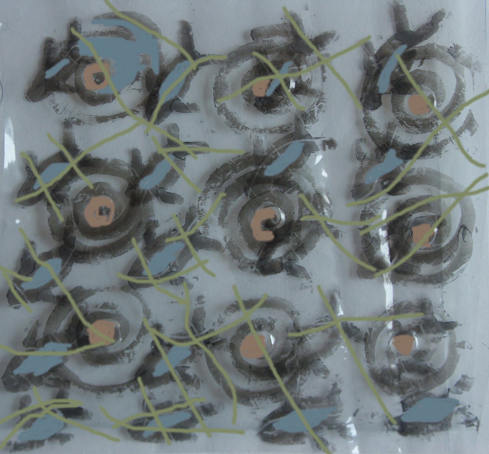
 IMAGE 10 SWIRLS
 IMAGE 11
 CHAPTER 9 DESIGNING WITH LAYERS.
SECTION A.
Using a transparent polythene sheet a series of marks were made with a thick permanent marker.
IMAGE 8 WAVY LINES
 IMAGE 9
FISH. Before the marker was dry, lines were made across the surface with a sharp point.
IMAGE 9
FISH. Before the marker was dry, lines were made across the surface with a sharp point.
 IMAGE 10 SWIRLS
 IMAGE 11
The same swirls but now they have a ' bubble' in the centre of each which was made by an eyelet fixing tool.
 IMAGE 12
 IMAGE 12
Wavy lines folded and unfolded.
 IMAGE 13
 IMAGE 13
 Triangular fold on fish.
 IMAGE 14
 IMAGE 14
 The layers unfolded and placed over one another. Not particularly successfully as the individual elements lose definition. The inclusion of the wavy line layer is particularly distracting.
 IMAGE 15
 CHAPTER 9 SECTION B
 IMAGE 17 SIZE A4
 IMAGE 18 SIZE A4
 IMAGE 19 .
 IMAGE 15
Learning the lesson from the image above the wavy line layer was left out. Colour was then digitally added to the two remaining layers. The central ' bubbles ' were highlighted and colour was applied to the lines on the fish which were oringinally scored on the surface.
 CHAPTER 9 SECTION B
PAINTING ON ACETATE LAYERS.
The object for study/'tracing' was a pair of sea shells.
IMAGE 16 SIZE , 4 A4 ACETATE SHEETS.
The sea shells were drawn in pairs and then coloured using a variety of methods.
Working from left to right on the top row-
A pair of coloured glue trails, markal paint sticks appled to the smooth and then sandpapered surface, A pair drawn with coloured inks with embossing pwder being added to the far right image.
Middle row different combinations of acrylic and silver paints
Bottom row
A pair of images made from needle holes threaded with rayon yarn, acrylic paints with the ribs on the shells being formed by the removal of paint.
At the bottom a 'background layer' in acrylics.
,
 IMAGE 17 SIZE A4
The acetate sheets were cut up into pairs of shells and then interleaved in a number of ways to create different effects. In this image a circle or fan shaped image was arranged.
 IMAGE 18 SIZE A4
This was one of a series of experiments to see the optimum number of layers it was best to work with. In general terms this was three but here 4 have been used with the top ones being more line drawings while the bottom silver paint images form a kind of shadow effect underneath.
 IMAGE 19 .
This image again includes 4 layers but this includes the markal images which did not really work with the inability of the acetate to absorb the colour. The coloured images include those made with glue trails, one with solid acrylic paints and one more of a 'stencil' form with paint removed to create the pattern on the shells.
 IMAGE 20
 IMAGE 20
 A series of skeleton and solid images arranged in a trail.

 IMAGE 22

IMAGE 21
Coloured image placed in the centre of the needle point shell outlines surrounded with threads.
 IMAGE 22
The needle hole threaded shell shapes against a painted background.
 IMAGE 23
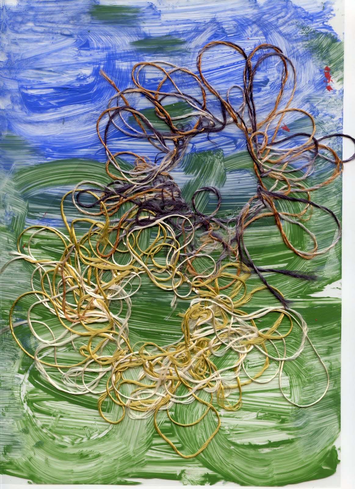 IMAGE 23
Coloured glue trail shapes added to image 22.
 CHAPTER 10 RESOLVED SAMPLES
 IMAGE 25 SIZE A4.
 CHAPTER 10 RESOLVED SAMPLES
 IMAGE 24 SIZE 4 X A4 SHEETS OF HANDMADE PAPER.
In making the initial sheets of paper I returned to some of the leaf studies for my second assessment piece and some of the ideas in the flower study.
 IMAGE 25 SIZE A4.
Once the paper was dry the leaves were removed from the paper , leaving the imprint of their vein patterns behind. These vein shapes were then sponged over with different forms of Markal paint sticks and fabric 'leaves' were cut from an organza and metallic ' sandwich'. The paper was then monted on an acetate sheet and the edges were then framed with stitched loops of rayon ribbon and threads dyed in Autumn shades. The fragile lacy edge of the handmade paper was preserved by melting back the acetate to the crumbled edge.
 IMAGE 26 SIZE A3
 IMAGE 26 SIZE A3
Sample of silk paper. The inspiration for this was some of the decorated papers made for the Hydrangea study in Module 4. The base was bleached white silk tops and this was overlaid by dyed gummed silk and throwsters waste. This was placed on the white backgound while still wet so that the residual dye bled into to background to give a blended colour across the piece.
 IMAGE 27 SIZE A3
 IMAGE 27 SIZE A3
This sample was formed from sections cut from the silk paper in image 26 and the flower petal paper in image 24 . The sections were overlaid with a sheet of bondaweb type fabric with toning random threads and then overstitched with automatic flower patterns.
 IMAGES 28 AND 29 SIZE, EACH 14 INCHES SQUARE.

 CHAPTER 12 ARTISTS STUDY.
 IMAGES 28 AND 29 SIZE, EACH 14 INCHES SQUARE.
The background fabric is a piece of nylon mesh used as a screen print mask. The mesh was then overlaid by cotton organdie screen printed fabric with a dragon fly pattern. The dragonfly motif was then overlaid by a turquoise metallic fabric and stitched round from the back of the two layers. The metallic fabric was then melted back to the stitching. A lacy web was worked on to vanishing muslin using a fringed cotton yarn couched down by machine stitching. The muslin was then dissolved away and the resulting lacy web was then hand stitched in place over the dragonfly.
The two pictures are designed to show both the transparent and the opaque views of the sample.

 CHAPTER 12 ARTISTS STUDY.
I have added to my research material details of the work of the following textile artists.
Julia Griffiths Jones . Especially samples of her wirework lace and suspended images.She draws inspiration from the sculptor Alexander Calder and the artist Jean Miro.
Karen Nicol. Another worker in contemporary interpretations of lace who was featured in the Jerwood contemporary makers exhibition in 2010.
Dawn Thorne 's book Transparency in textiles opens up a number of avenues to study.


